Sans vs. Serif
In the arena of typography, two champions have long stood toe-to-toe:
Each has its loyal followers, its preferred domains, and its unique strengths. But this isn't a fight to the death. In fact, the most compelling battles are those where these two titans join forces.
In one corner, we have serif fonts, the seasoned veterans. Think Times New Roman or Garamond. Their defining feature? Small lines or strokes attached to the ends of larger strokes in a letter or symbol. These fonts exude tradition, reliability, and comfort. They're the old friends we turn to when we want our text to be easily read in print, with serifs guiding the eye along the lines of text.
They’re classy, sexy, sophisticated, and seem rich.
In the other corner, sans serif fonts, the modern mavericks. Helvetica or Arial might come to mind. Sans serif fonts lack the embellishing strokes of their counterparts. Their clean, straightforward design gives them a contemporary, minimalist appeal. They're the go-to for digital designs, where clarity and simplicity are paramount.
They’re young, unpretentious, no-bullshit.
The Power of the Tag Team:
While each type has its strengths and uses, the magic happens when serif and sans serif fonts tag team. This combination can provide contrast, create hierarchy, and guide the reader's eye through the design.
Consider this: a strong serif display font paired with a clean, minimal sans serif body font. The serif font grabs attention and makes a bold statement, while the sans serif font provides a clean, easy-to-read body text.
This combination can create a modern, sophisticated design, perfect for editorial layouts, branding, and more.
Or flip the script: a big, bold sans serif headline font with a classic, easy-to-read serif font for body copy. The sans serif font creates a strong, modern impression, while the serif font adds a touch of tradition and comfort.
This combination can be ideal for websites, presentations, and digital designs.
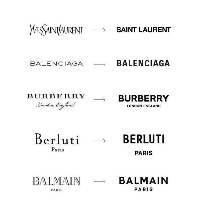
The Fashion Industry Weighs In:
Even the fashion industry is getting in on the action. Luxury fashion is moving away from the minimalist sans serif logos that have been en vogue in recent years. Brands like Burberry are reintroducing serif fonts, bringing character and personality back into their logos.
This is a good thing.
The Verdict:
In the battle of typography, there's no need to choose between serif and sans serif. By understanding their characteristics and strengths, you can use both to create effective and visually appealing designs. Whether you're designing a website, a brand logo, or a print layout, the combination of serif and sans serif fonts can add depth, contrast, and balance to your design.
So, serif and sans serif: a battle for the ages, or a match made in heaven?